The design is a homage to GapMinder’s famous interactive on the “Wealth & Health of Nations”, popularized by Hans Rosling. Click on “linear scale” for maximum effect.
Visit website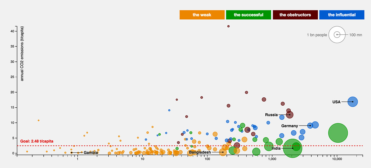
This is an example of the data visualization and web development work I did for CORRECTIV and one of the rare pieces we published in English. This interactive graphic maps nations on a scatter plot according to their GDP, population and annual CO2 emissions. It was part CORRECTIV’s reporting on the 2015 UN climate change conference.
The data research for the piece was done by Stefan Wehrmeyer and Annika Joeres. I designed it and wrote most of the code. Additional web development was done by Christopher Möller and Moritz Klack.
The design is a homage to GapMinder’s famous interactive on the “Wealth & Health of Nations”, popularized by Hans Rosling. Click on “linear scale” for maximum effect.
Visit website
This piece was originally published on “Das Paris Protokoll”, a website that provided in-depth reporting from the UN Climate Change Conference. It was a collaboration between CORRECTIV and German public broadcaster NDR.
Visit website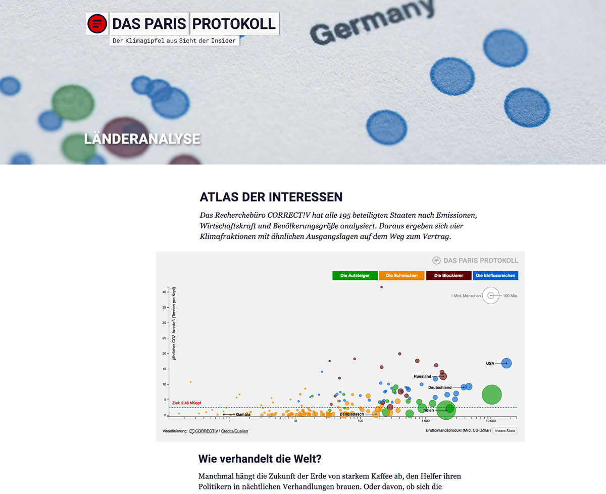
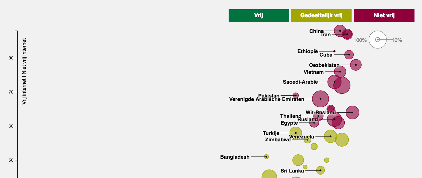
The code for this project has been reused by OneWorld magazine in Holland to visualize the state of internet censorship around the world.
Visit website